> ## Documentation Index
> Fetch the complete documentation index at: https://docs.creao.ai/llms.txt
> Use this file to discover all available pages before exploring further.
# Widgets
> Browse the visual components that make up dashboards in agent sessions.
## Overview
Widgets are the building blocks of dashboards. Each dashboard rendered in chat or agent sessions is composed of individual widgets — KPI cards, charts, tables, progress bars, and layout containers.
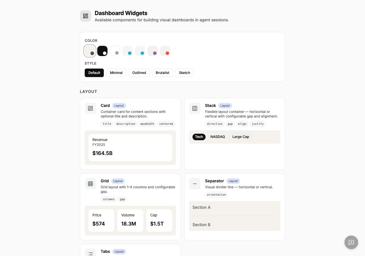
The **Widgets** page in Agent Brain lets you browse all available components and see live previews with mock data. Dashboard widgets use a single CREAO design system so dashboards stay visually consistent across chat, agent sessions, and saved run views.
 ## Widget categories
### Layout
Layout widgets control how other widgets are arranged:
| Widget | Description |
| ------------- | -------------------------------------------------------------------------------------- |
| **Card** | Container with optional title and description — the most common wrapper for KPI values |
| **Stack** | Flexible horizontal or vertical layout with configurable gap and alignment |
| **Grid** | Grid layout with 1–4 columns |
| **Separator** | Visual divider line |
| **Tabs** | Tab navigation with multiple content panels |
### Data Display
Data widgets show values, text, and structured information:
| Widget | Description |
| ------------ | ---------------------------------------------------------------- |
| **Heading** | Large text for KPI values and section titles (h1–h4) |
| **Text** | Paragraph text with variants: body, caption, muted, lead, code |
| **Badge** | Compact label for status indicators, growth rates, and tags |
| **Alert** | Banner for important messages — info, success, warning, or error |
| **Progress** | Progress bar showing a value from 0 to 100 |
| **Table** | Data table with column headers and rows |
| **Image** | Image display (HTTPS sources only) |
### Charts
Chart widgets visualize time-series and categorical data:
| Widget | Description |
| -------------------- | -------------------------------------------------------------------- |
| **LineChart** | Line chart for trends with multiple series support |
| **AreaChart** | Filled area chart — ideal for growth metrics and price trends |
| **BarChart** | Bar chart for categorical comparisons and volume data |
| **CandlestickChart** | Professional TradingView-style chart with OHLCV data and volume bars |
## Design system
Dashboard widgets use CREAO's product design system: warm canvas surfaces, cream cards, near-black ink, hairline rules, sharp corners, and restrained semantic color. Oxblood marks important negative or signature states, while green is reserved for running or positive status signals.
The design is fixed by the product so previously generated dashboards and new dashboards render with the same visual language. Dashboard data and layout remain defined by the widget tree.
## How dashboards use widgets
When the agent generates a dashboard (in chat or during an agent run), it assembles widgets into a tree structure:
1. A **layout widget** (Stack or Grid) at the root organizes the sections
2. **Card** widgets wrap each metric or data group
3. **Data widgets** (Heading, Badge, Text) display values inside cards
4. **Chart widgets** render visualizations at full width
5. **Table** and **Alert** widgets add structured data and callouts
The agent decides which widgets to use based on the data it gathered. The dashboard template (captured when you create an agent) preserves the layout structure so future runs produce consistent output.
## Widget categories
### Layout
Layout widgets control how other widgets are arranged:
| Widget | Description |
| ------------- | -------------------------------------------------------------------------------------- |
| **Card** | Container with optional title and description — the most common wrapper for KPI values |
| **Stack** | Flexible horizontal or vertical layout with configurable gap and alignment |
| **Grid** | Grid layout with 1–4 columns |
| **Separator** | Visual divider line |
| **Tabs** | Tab navigation with multiple content panels |
### Data Display
Data widgets show values, text, and structured information:
| Widget | Description |
| ------------ | ---------------------------------------------------------------- |
| **Heading** | Large text for KPI values and section titles (h1–h4) |
| **Text** | Paragraph text with variants: body, caption, muted, lead, code |
| **Badge** | Compact label for status indicators, growth rates, and tags |
| **Alert** | Banner for important messages — info, success, warning, or error |
| **Progress** | Progress bar showing a value from 0 to 100 |
| **Table** | Data table with column headers and rows |
| **Image** | Image display (HTTPS sources only) |
### Charts
Chart widgets visualize time-series and categorical data:
| Widget | Description |
| -------------------- | -------------------------------------------------------------------- |
| **LineChart** | Line chart for trends with multiple series support |
| **AreaChart** | Filled area chart — ideal for growth metrics and price trends |
| **BarChart** | Bar chart for categorical comparisons and volume data |
| **CandlestickChart** | Professional TradingView-style chart with OHLCV data and volume bars |
## Design system
Dashboard widgets use CREAO's product design system: warm canvas surfaces, cream cards, near-black ink, hairline rules, sharp corners, and restrained semantic color. Oxblood marks important negative or signature states, while green is reserved for running or positive status signals.
The design is fixed by the product so previously generated dashboards and new dashboards render with the same visual language. Dashboard data and layout remain defined by the widget tree.
## How dashboards use widgets
When the agent generates a dashboard (in chat or during an agent run), it assembles widgets into a tree structure:
1. A **layout widget** (Stack or Grid) at the root organizes the sections
2. **Card** widgets wrap each metric or data group
3. **Data widgets** (Heading, Badge, Text) display values inside cards
4. **Chart widgets** render visualizations at full width
5. **Table** and **Alert** widgets add structured data and callouts
The agent decides which widgets to use based on the data it gathered. The dashboard template (captured when you create an agent) preserves the layout structure so future runs produce consistent output.